Alex
Youngling
 Human
Human
Posts: 68
|
Post by Alex on Nov 25, 2007 22:52:32 GMT -5
|
|
Alex
Youngling
Human
Posts: 68
|
Post by Alex on Nov 26, 2007 7:12:44 GMT -5
Any suggestions?
|
|
|
|
Post by Christina Scabbia on Nov 26, 2007 7:38:54 GMT -5
2nd or 4th
|
|
Alex
Youngling
Human
Posts: 68
|
Post by Alex on Nov 26, 2007 13:14:41 GMT -5
Yeah, I'm between those two as well and I dunno. >.<
|
|
|
|
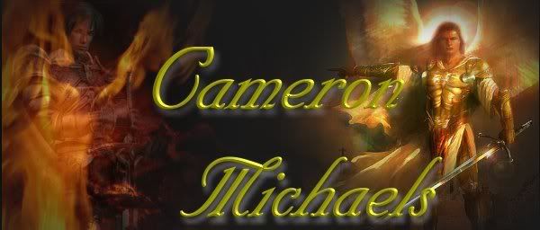
Post by Cameron Michaels on Nov 26, 2007 13:30:56 GMT -5
I like the first one.
|
|
|
|
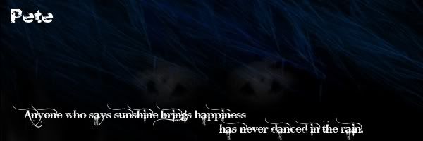
Post by Pete on Nov 26, 2007 16:08:29 GMT -5
My votes for #2
|
|
|
|
Post by Chade on Nov 26, 2007 16:18:16 GMT -5
Same, two or three.
|
|
|
|
Post by Pete on Nov 26, 2007 16:27:19 GMT -5
I would put a radial motion blur on the text, maybe a soft glow. But you'd have to make it less transparent. (my two cents.) xD i envy you guys, i cant make pic sigs, just cool designs and such.
|
|
Alex
Youngling
Human
Posts: 68
|
Post by Alex on Nov 26, 2007 16:30:41 GMT -5
Haha yeah see I don't know how to do much of that...I'll try after I get off work tonight.
|
|
|
|
Post by Pete on Nov 26, 2007 16:34:49 GMT -5
dont work too hard d(>.<)b
|
|
|
|
Post by Drake on Nov 26, 2007 20:11:31 GMT -5
I like number 1
|
|
|
|
Post by Samantha Andrews on Nov 26, 2007 21:01:05 GMT -5
2nd or 4th
|
|
|
|
Post by Perrin on Nov 26, 2007 21:01:28 GMT -5
4th
|
|
|
|
Post by Pablo on Nov 26, 2007 22:01:21 GMT -5
2nd... I think number two wins.
|
|
|
|
Post by Jasper on Nov 26, 2007 22:03:17 GMT -5
I like second. fourth is good too though.
|
|